District branding
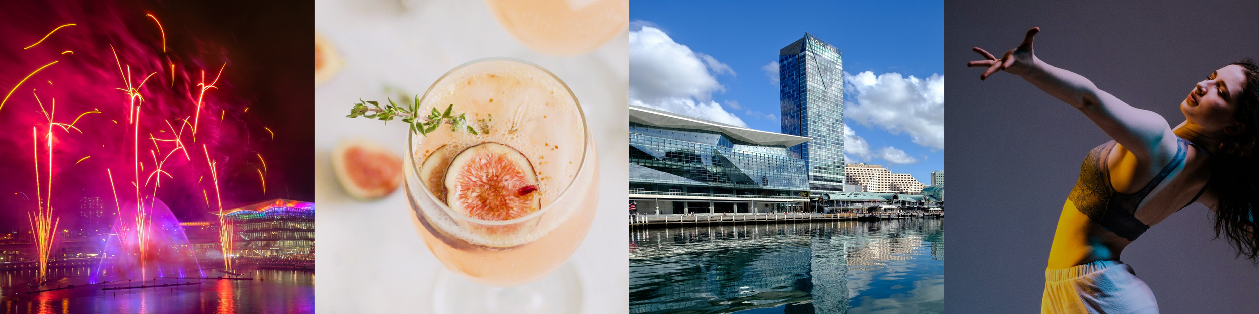
A globally renowned visitor attraction.
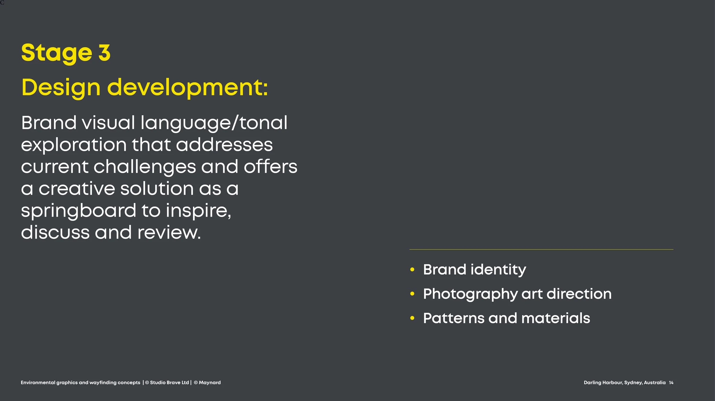
The brief
A sister project to ‘The Rocks’ district brand project: A development of the existing Darling Harbour brand - Sydney’s business and entertainment hub.

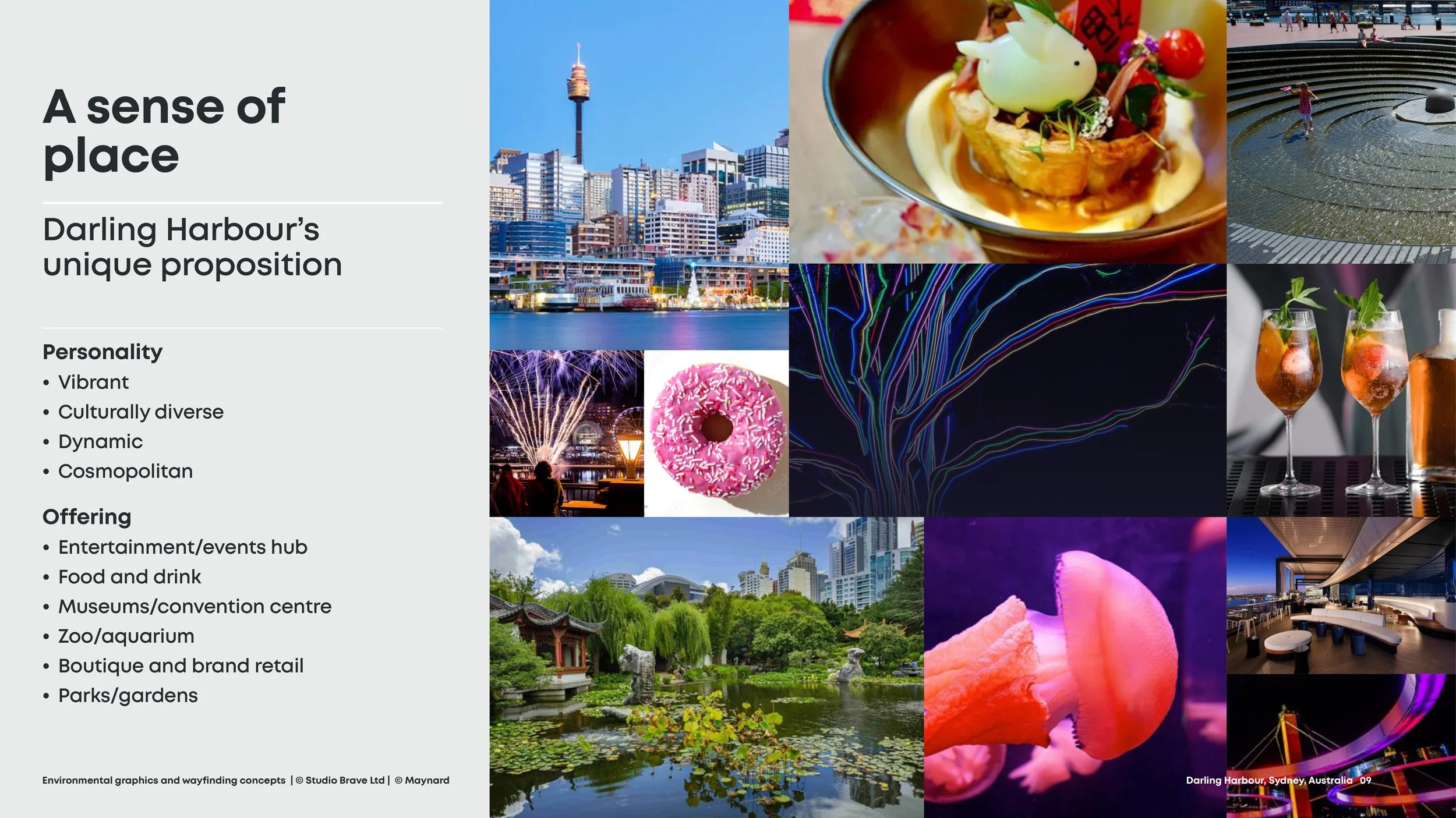
Brand proposition
A confident stance with global appeal
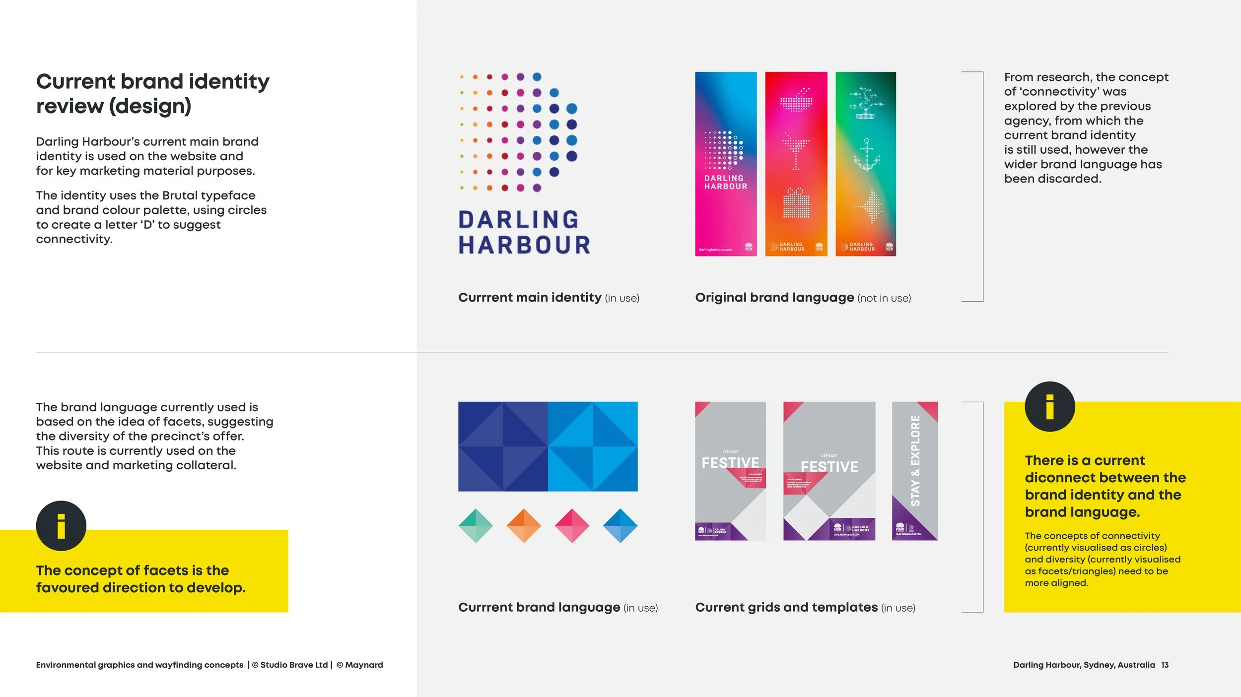
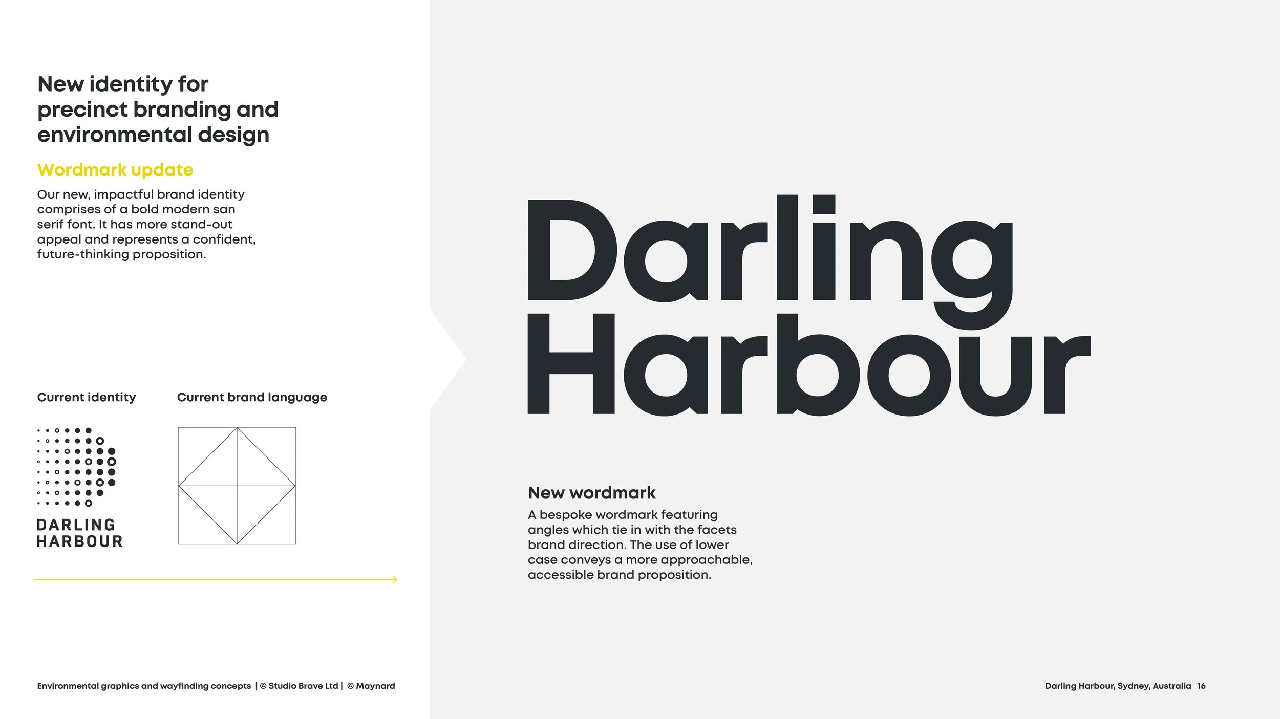
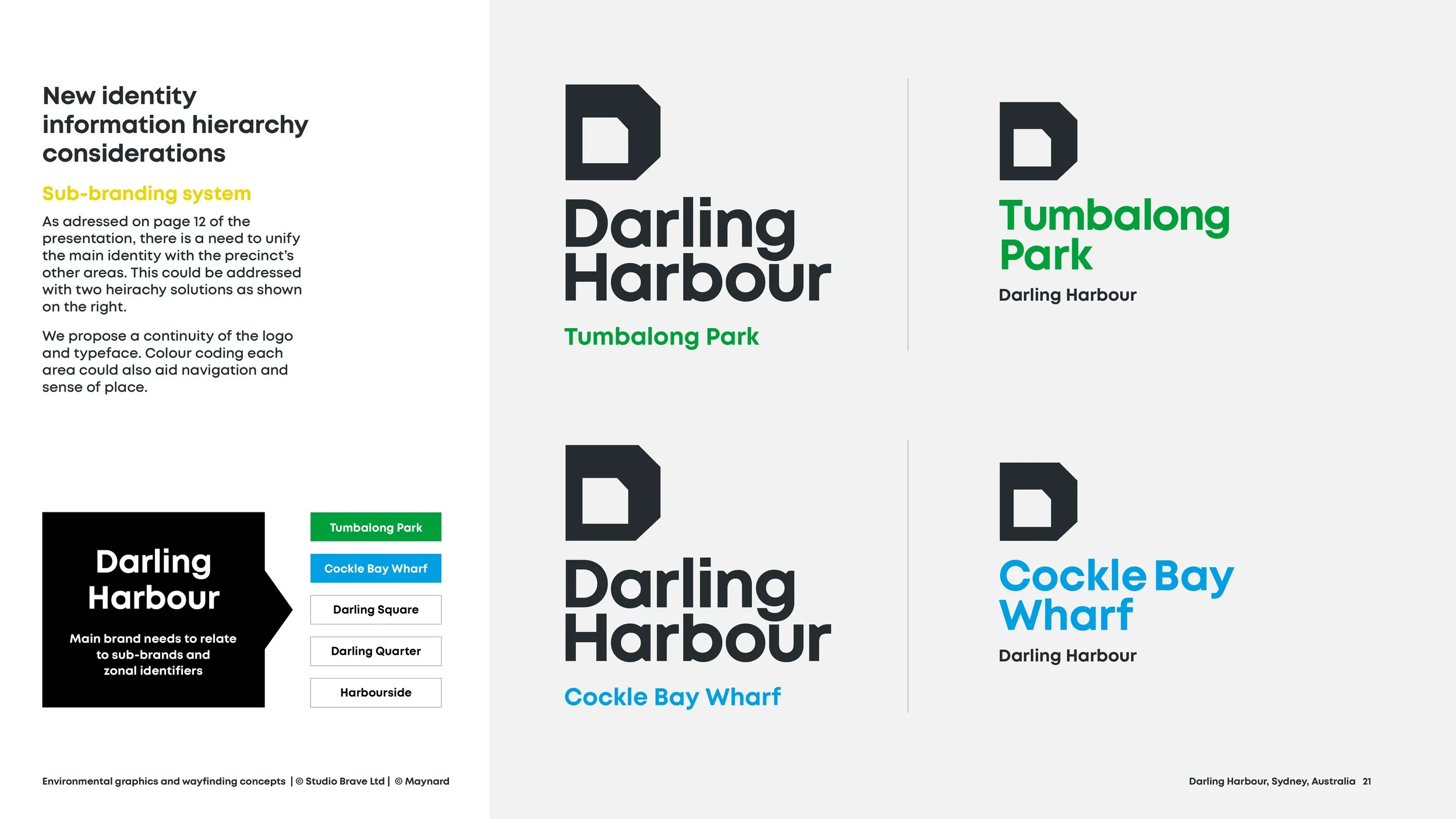
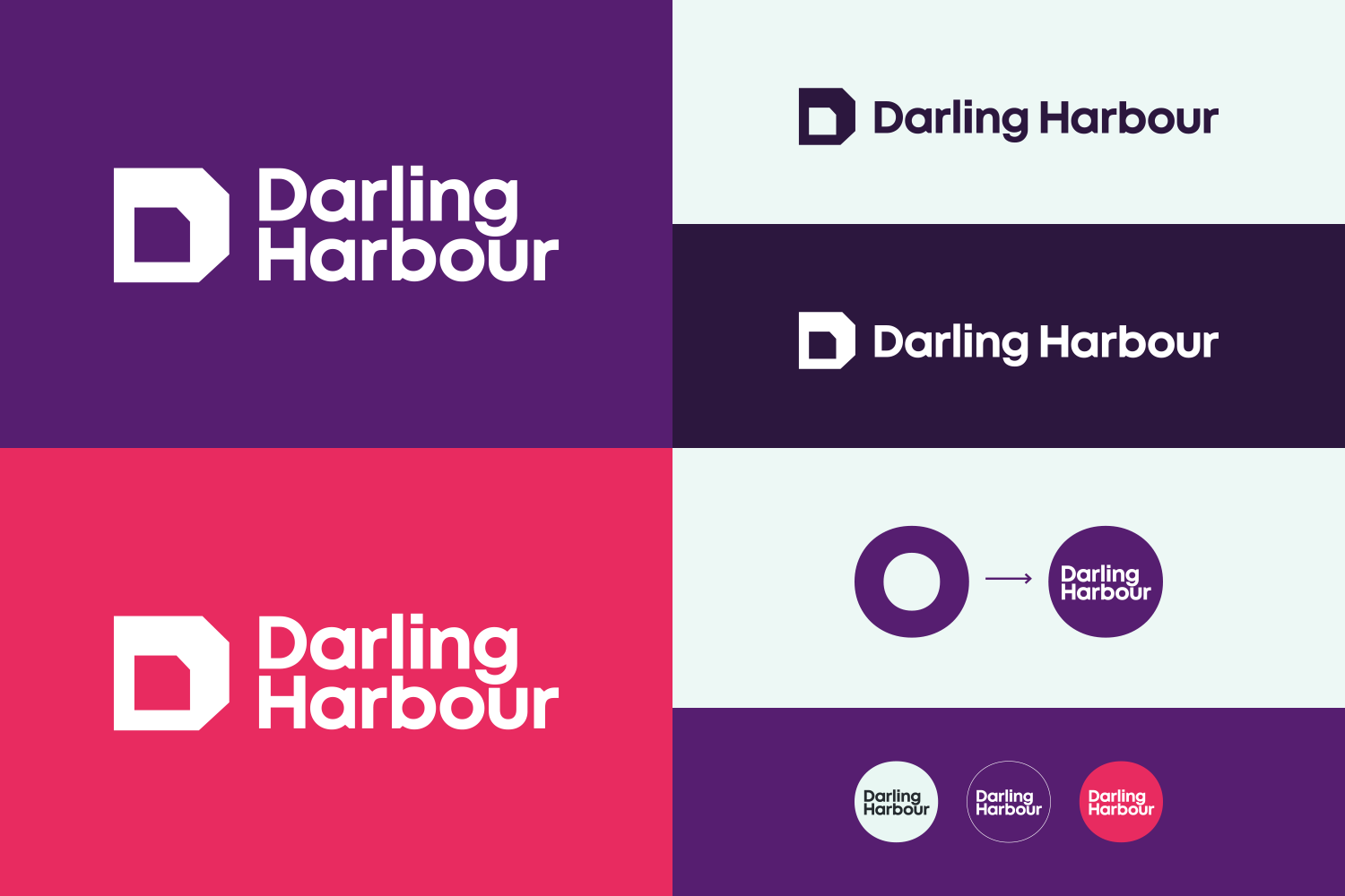
Brand identity toolkit
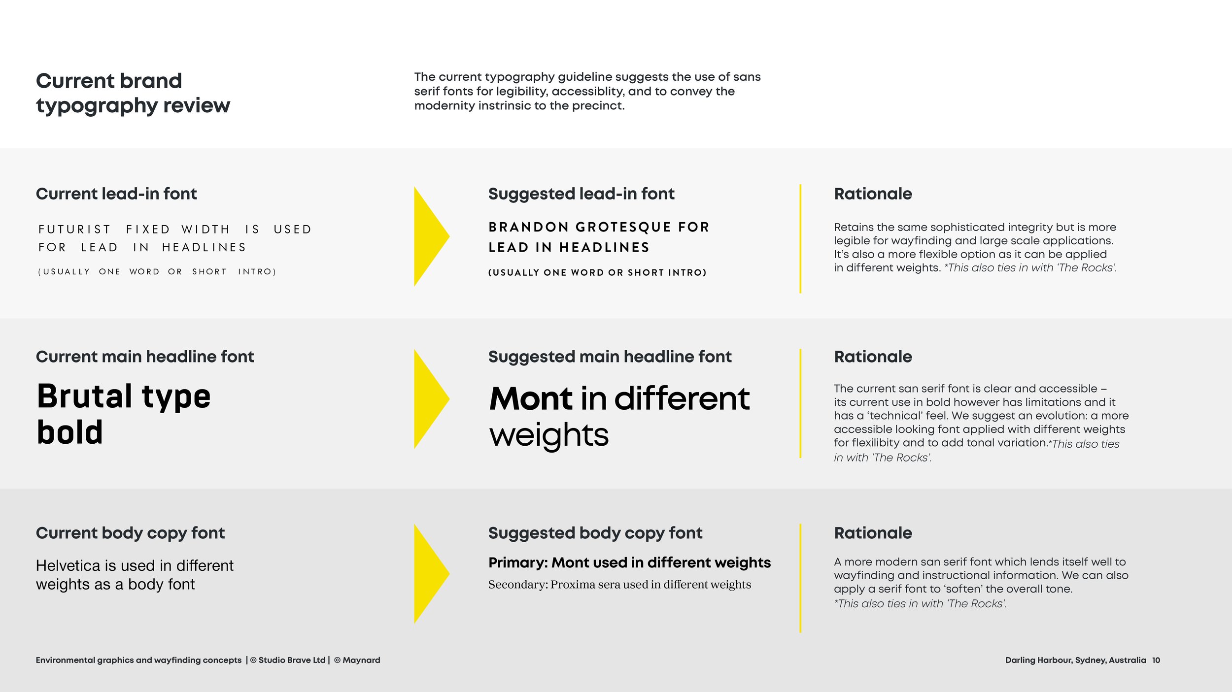
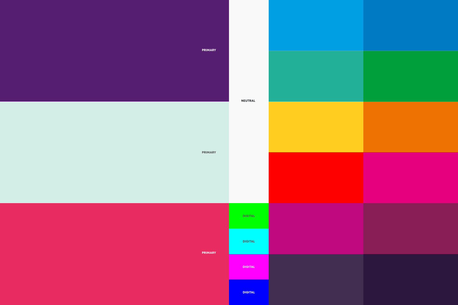
An impactful word-mark; a more vibrant colour palette and an updated contemporary brand font, selected for its legibility and ability to use across multiple weights/scales.


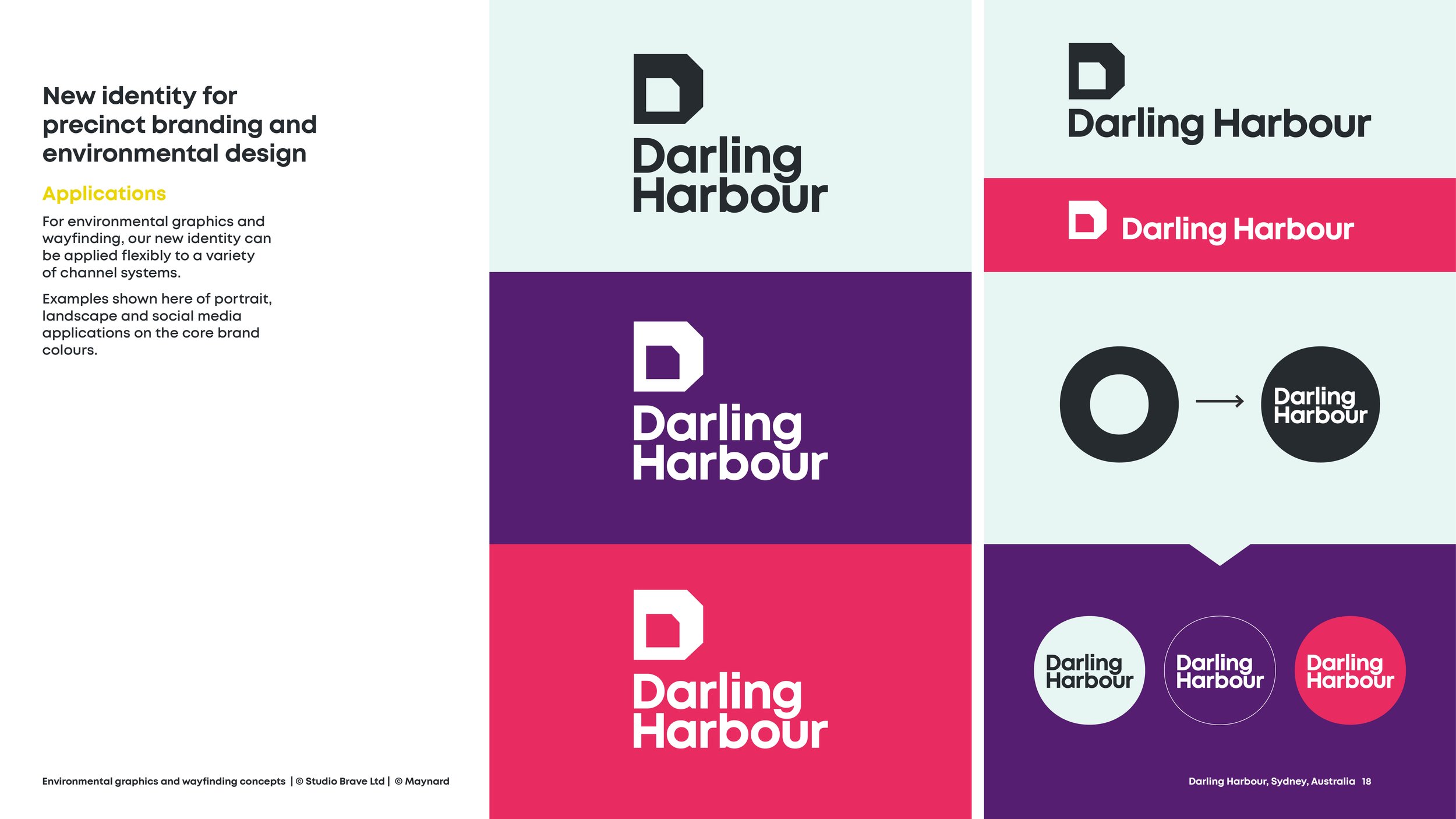
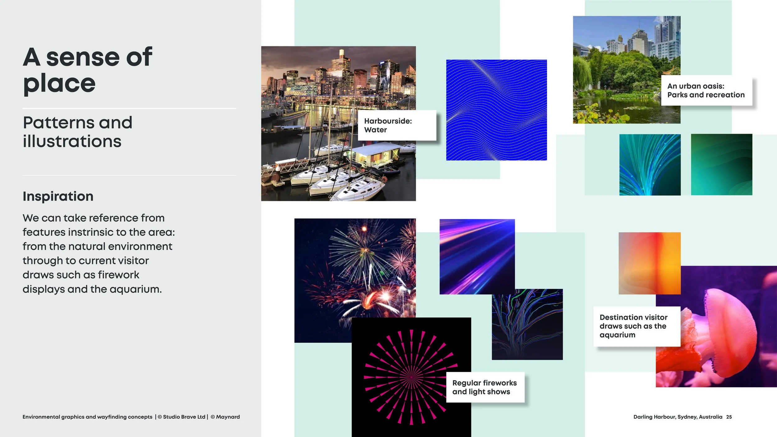
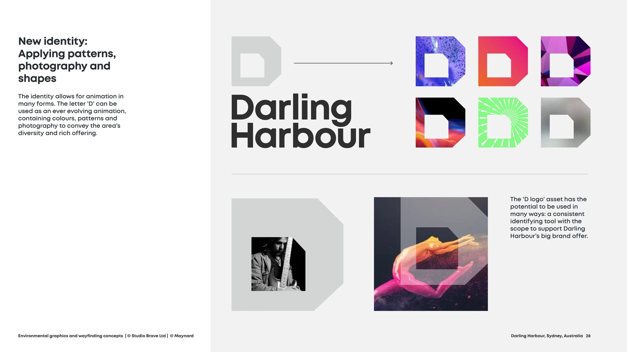
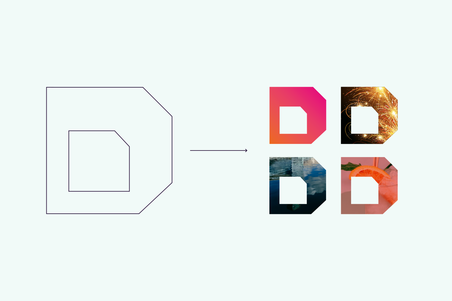
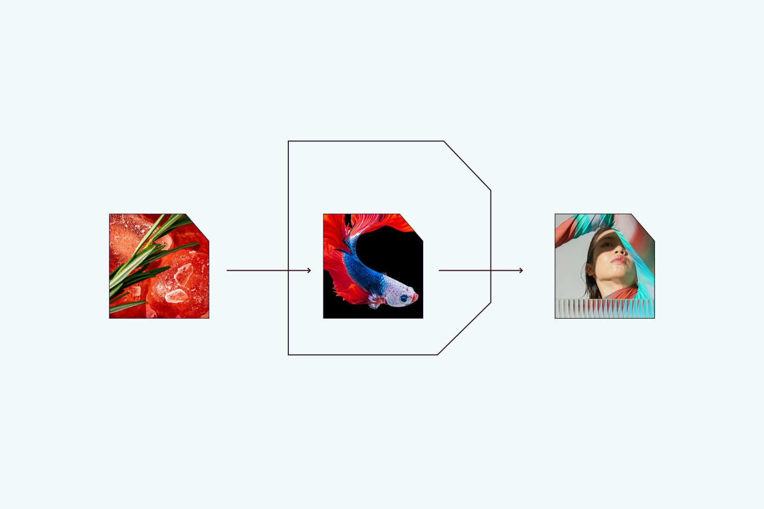
Visual language assets
Photography art direction and styling; How the letter ‘D’ can be used with photography to create a flexible system and how the mark can be animated.


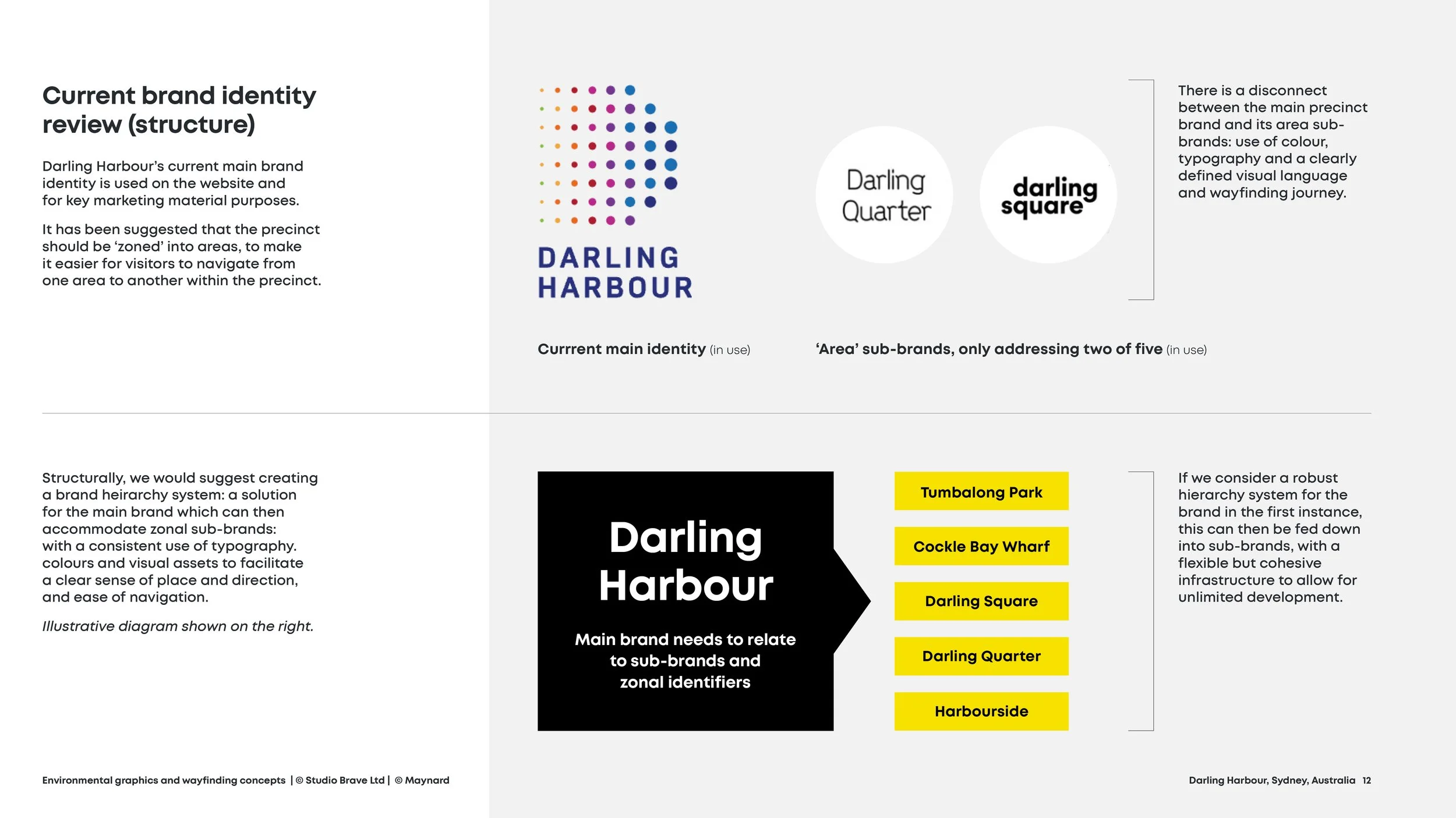
Brand structure
A cohesive, flexible visual language


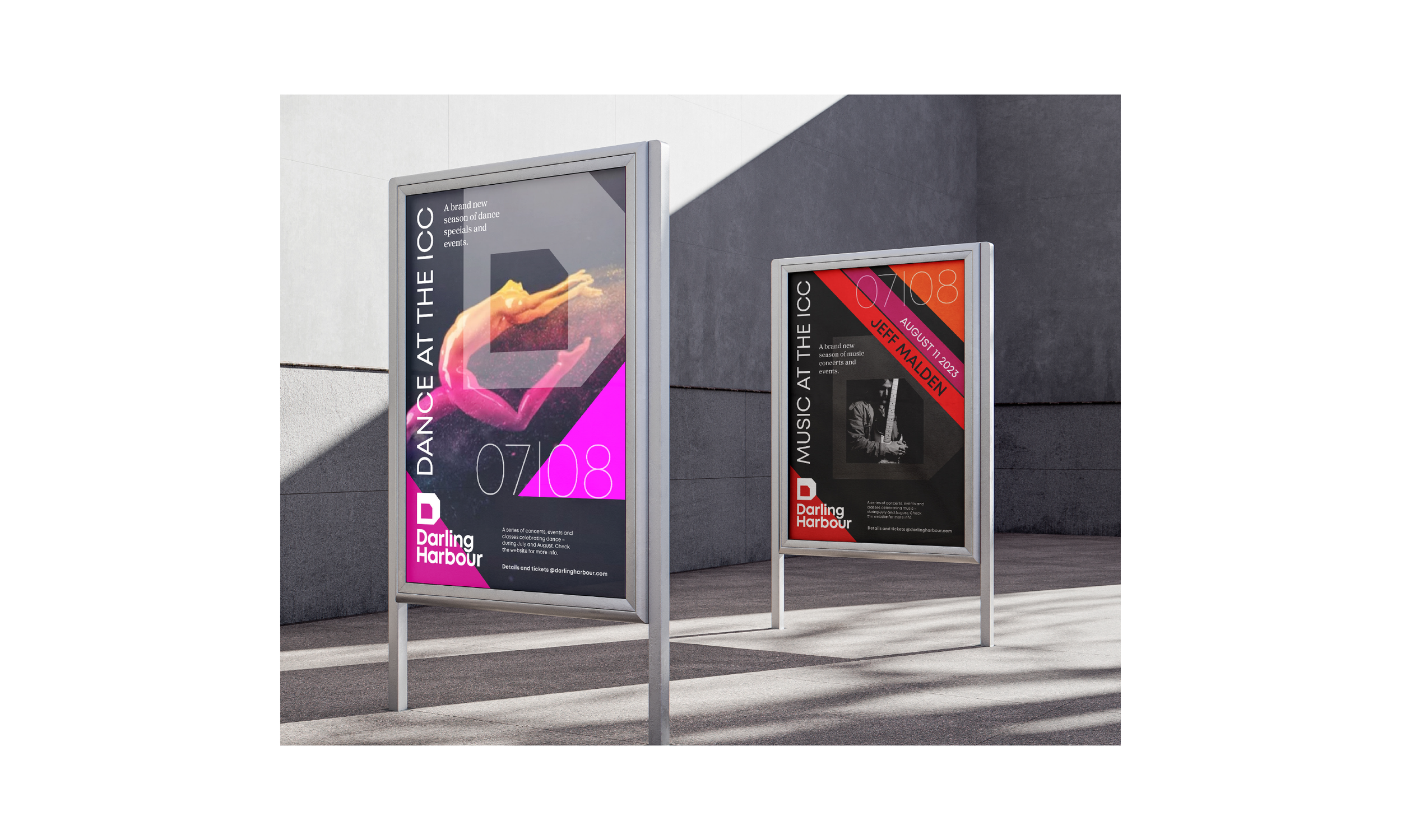
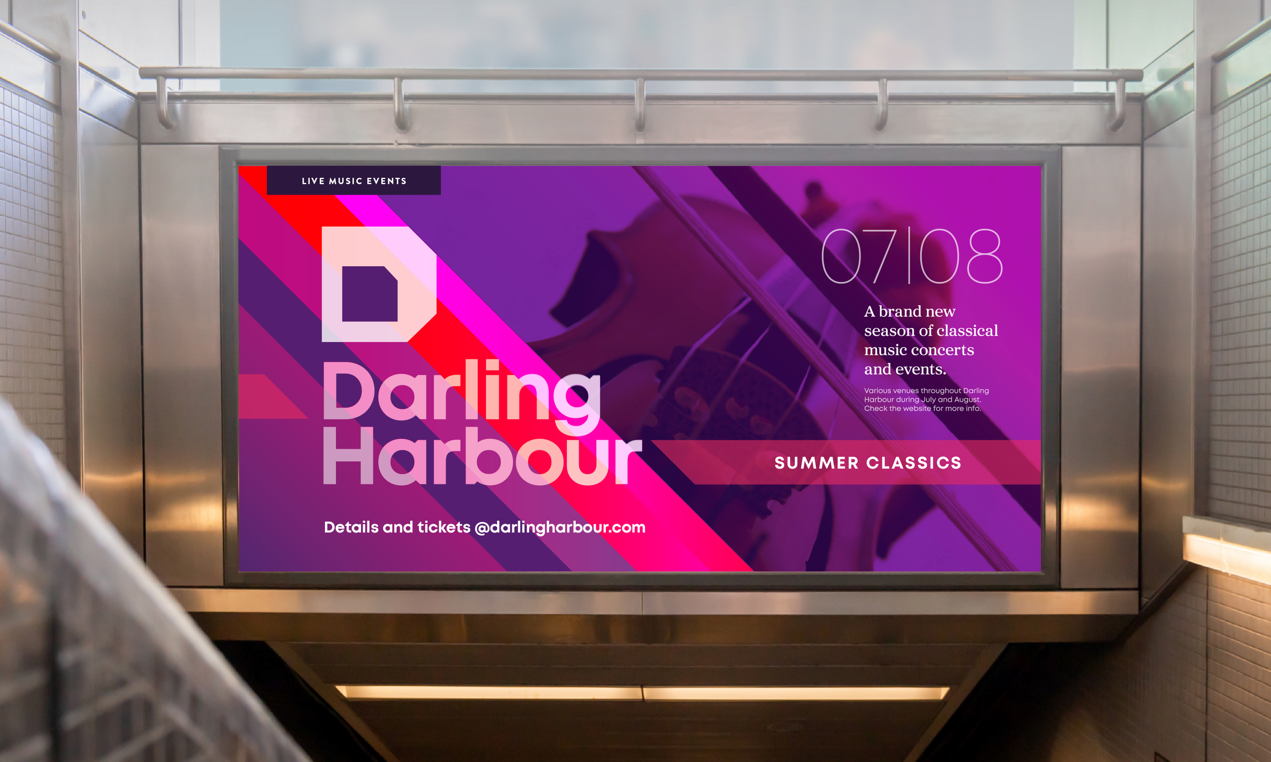
A practical multi-channel system
A flexible visual toolkit that can be templated across print and digital applications; allowing for a dynamic variation in scale and impact whilst remaining cohesive.


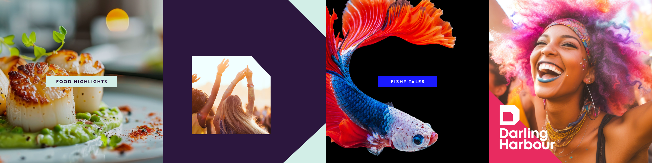
Social media
Templates for easy social media post applications utilising the brand assets in a simple but impactful way. The brand direction remains clean and simple for legibility.
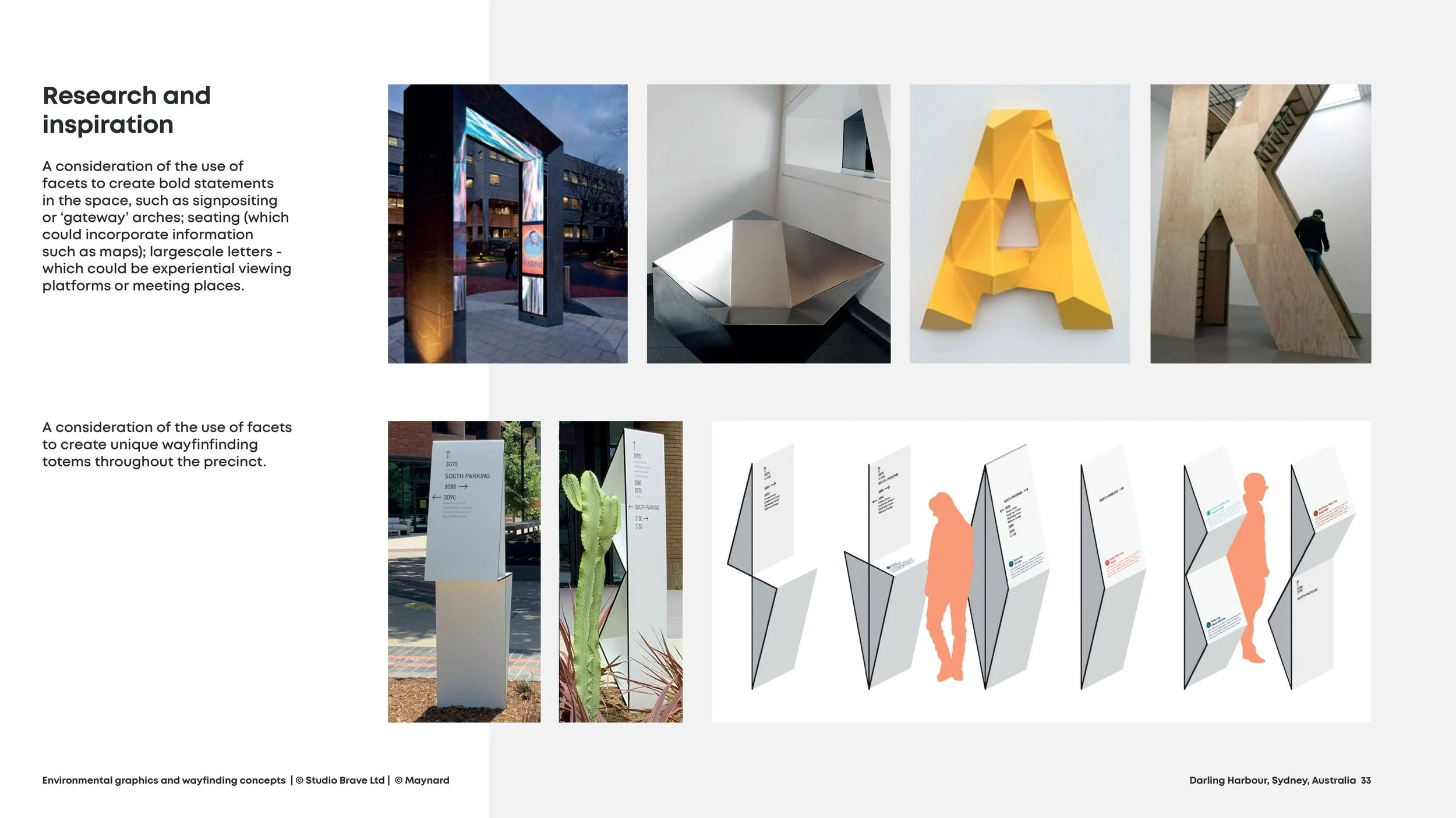
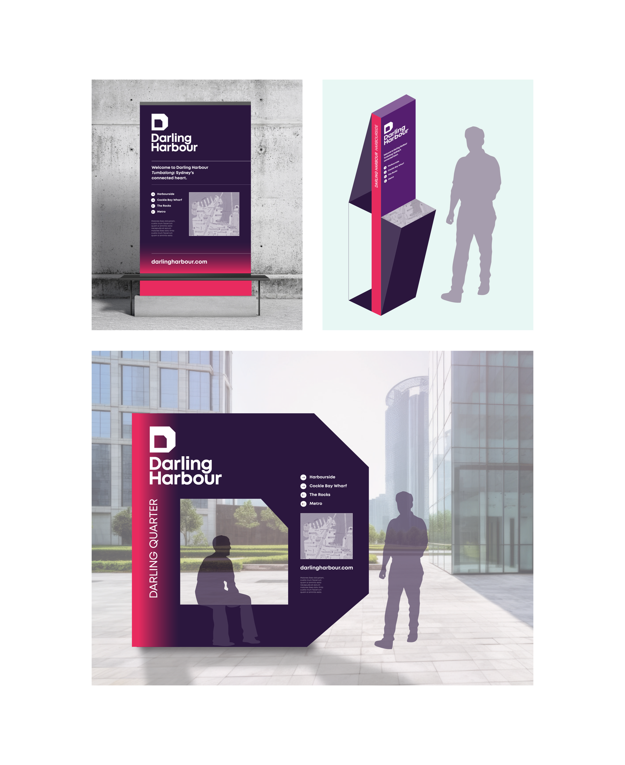
Wayfinding
From practical totems to impactful environmental signage, the brand considers legibility, and effective information hierarchy at any scale.
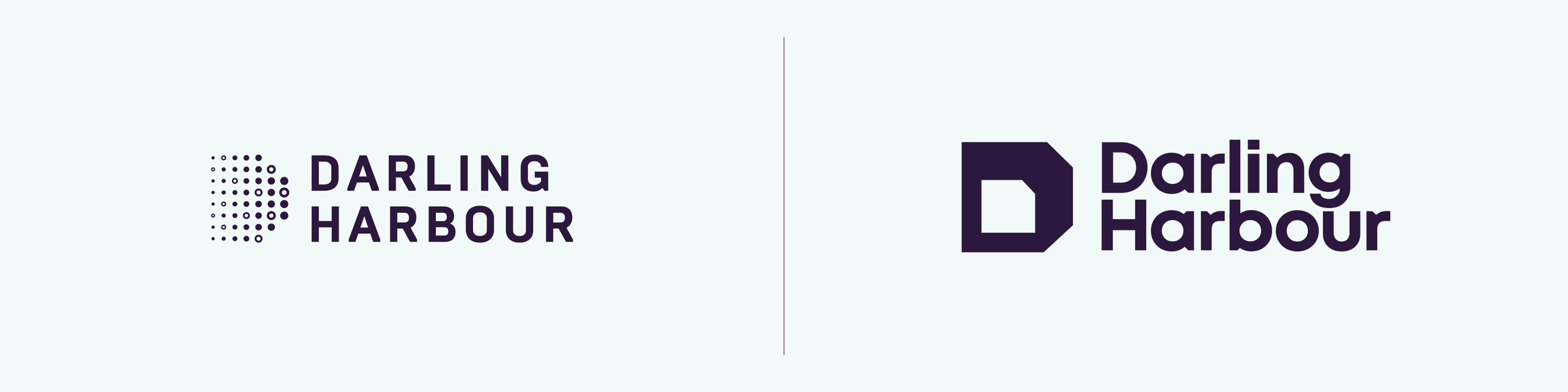
Brand evolution
The before and after
Background story
Brief • Strategy • Process • Design • Application